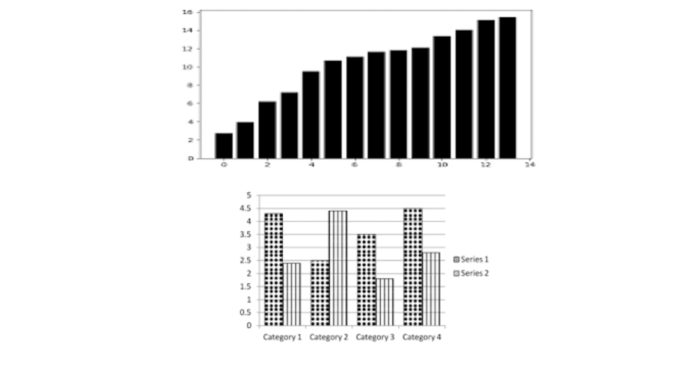
A bar plot in Matplotlib is a graphical representation used to display categorical data with rectangular bars.
The length of each bar is proportional to the value it represents. Matplotlib, a popular Python library for data visualization, provides the bar() function to create bar plots.
To create a simple bar plot, you first import Matplotlib’s pyplot module:
python
import matplotlib.pyplot as plt
You can then define your data and use the bar() function:
python
categories = [‘A’, ‘B’, ‘C’, ‘D’]
values = [3, 7, 8, 5]
plt.bar(categories, values)
plt.show()
In this example, categories represent the labels on the x-axis, while values represent the height of the bars.
Matplotlib allows customization of bar plots with parameters like color, width, and align. You can also add titles, labels, and legends using functions like plt.title(), plt.xlabel(), and plt.legend().
For grouped or stacked bar plots, you can use the bar() function multiple times with adjusted positions.
Bar plots are particularly useful for comparing quantities across different categories, making them a common choice for presenting categorical data visually.


