Cursive handwriting has different styles and variations for capital letters, each contributing to the overall aesthetic and legibility of the writing. These variations can differ depending on the region, the writing tradition, and the intended use. Here’s a breakdown of common variations in cursive capital letters:
1. Traditional Cursive:
- Standard cursive capital letters, often learned in elementary school, are linked to the lower-case letters in flowing strokes.
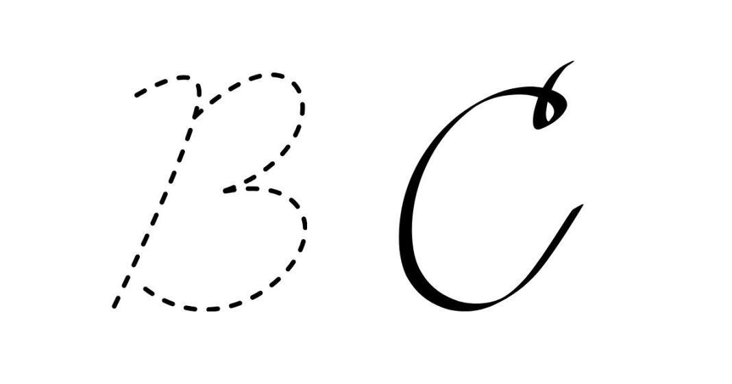
- Examples: The “A” starts at the top with a loop and descends, the “B” has a wide rounded loop, and the “C” has a simple curve.
2. Formal Cursive:
- This style is often used in more professional, elegant contexts, such as invitations or formal documents.
- Letters tend to have more exaggerated curves and loops, especially in the “L”, “S”, and “J”, making them more ornate.
- Example: The “G” may have a more elaborate loop that loops around to the right, while the “F” may have a tall, sweeping flourish.
3. Italic Cursive:
- Italic cursive is a slanted form of cursive that is often used for emphasis in documents or art. It has a more angular and formal appearance.
- It features straight lines more than rounded ones and is often used in calligraphy.
- Example: The “S” might appear more angular with sharp bends rather than rounded curves.
4. Looped Cursive:
- This variation includes larger and more pronounced loops, particularly in letters like “L”, “E”, “F”, and “H”. It’s often seen in older handwriting styles.
- Example: The “B” may have a large loop, and the “D” may feature a more pronounced loop in the tail.
5. Modern Cursive:
- Modern cursive handwriting tends to be simpler and more minimalistic. The loops are smaller, and strokes may be more streamlined for faster writing.
- Example: The “E” might not have an upper loop but rather be written with a straight-line stroke to the right, simplifying the letter.
6. Calligraphic Cursive:
- This is often seen in highly decorative writing, like invitations or formal certificates. It features exaggerated strokes, flourishes, and extended loops.
- Example: The “K” could be drawn with a sweeping curve from the top, and the “T” may have a long, decorative tail.
7. Cursive with Simplified Strokes:
- Some cursive styles simplify or eliminate certain flourishes, making it easier to write quickly and legibly.
- Example: The “M” might be written without the usual curves, opting for straight, angular strokes.
8. Connected vs. Non-Connected:
- Connected Cursive: In traditional cursive writing, the capital letters are often connected to the next letter, like in the lowercase cursive letters. This style helps maintain fluidity and speed.
- Non-Connected Cursive: Some cursive variations, particularly in modern teaching or artistic settings, may leave certain letters (like “B” or “M”) unconnected, making them more readable for beginners or for a more formal appearance.
9. Slant Variation:
- Cursive can vary based on the degree of slant. Some styles have a sharp slant, while others have a more upright or slightly slanted form.
- Example: In a sharp slant, letters like “A” or “Z” might appear more leaning forward, while in a more upright style, they will appear straighter.
10. Regional Variations:
- Different countries or regions may have subtle variations in cursive handwriting. For instance, American cursive tends to be more rounded and fluid, while British cursive might emphasize more angular strokes.
- Example: In American cursive, the “R” often has a single loop at the top, while in some European cursive styles, the “R” might have a slightly different shape or curvature.
11. Monoline Cursive:
- This style is characterized by uniform stroke thickness, unlike traditional cursive, where thick and thin lines are alternated depending on the direction of the stroke. Monoline cursive is cleaner and simpler, often seen in modern calligraphy and digital fonts.
- Example: The “T” might appear uniform without any thick or thin variations in the lines.
12. Artistic Cursive:
- Sometimes cursive letters are designed in a more creative, artistic way. This includes playful, exaggerated loops, flourishes, or even integrating elements of other fonts or styles.
- Example: A “J” might have an extended swoosh or a “G” might include intricate swirls.
Some Examples of Capital Letters in Different Cursive Styles:
- A: Traditional cursive usually has a looped top, while in modern cursive, it may just be a simple arch.
- B: Often features a rounded loop in traditional cursive but can appear more angular in an italic style.
- C: Typically a simple curve in all cursive styles, though in calligraphy it may have more flourish at the end.
- S: In traditional cursive, it is usually round, but in italic or formal cursive, it may be more angular with sharp corners.
- F: Often features a tall upward stroke with a loop or flourish at the top, especially in traditional or calligraphic styles.
Conclusion:
There are many variations of cursive capital letters, each suited to different uses, from everyday handwriting to elegant calligraphy. While traditional cursive emphasizes loops and flowing strokes, modern cursive tends to be simpler and quicker. The style you choose to use can depend on your personal preference, the context of your writing, and the desired aesthetic. Whether you’re writing a letter, creating art, or simply practicing handwriting, understanding the different variations of cursive letters can help you choose the right style for your needs.


