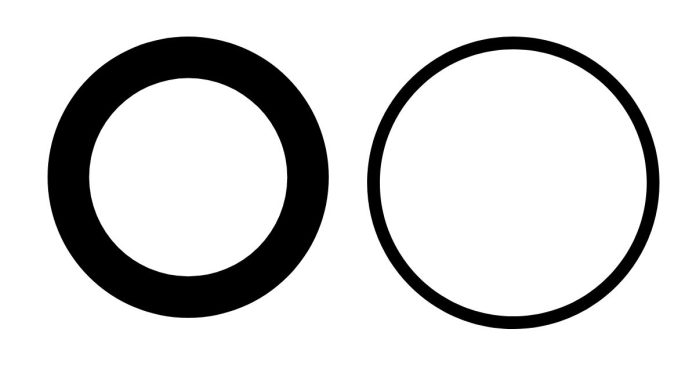
CSS is a versatile tool for designing beautiful and functional websites. Among its many capabilities is the ability to create shapes, such as circles. Adding a border to a CSS circle can enhance its visual appeal and help define its style. In this post, we’ll walk through the steps to create a CSS circle with a border.
Step 1: Basic Circle Creation
To create a circle using CSS, we’ll start by defining a square element. Circles are essentially squares with fully rounded corners. Here’s the code:
<div class=”circle”></div>
.circle {
width: 100px;
height: 100px;
background-color: #3498db; /* Choose any color */
border-radius: 50%; /* Makes the square a circle */
}
Step 2: Adding a Border
Adding a border to the circle is straightforward. Simply use the border property in your CSS:
.circle {
width: 100px;
height: 100px;
background-color: #3498db;
border-radius: 50%;
border: 5px solid #2ecc71; /* Border width and color */
}
In this example:
5pxis the border width.solidspecifies the border style.#2ecc71is the color of the border.
Step 3: Customizing the Circle
You can further customize your circle by:
- Adjusting the Size: Change the
widthandheightvalues to make the circle larger or smaller.
.circle {
width: 150px;
height: 150px;
}
2. Using Gradient Backgrounds: Replace the solid color with a gradient for a more dynamic look.
.circle {
background: linear-gradient(135deg, #ff7e5f, #feb47b);
}
3. Adding Shadows: Use the box-shadow property for a 3D effect.
.circle {
box-shadow: 0 4px 8px rgba(0, 0, 0, 0.2);
}
Step 4: Making the Circle Responsive
To make the circle responsive, use percentage values for the width and height, and set the border size proportionally:
.circle {
width: 20%;
height: 20%;
border: 2% solid #2ecc71;
}
Practical Use Cases
CSS circles with borders can be used in various scenarios, such as:
- Profile pictures
- Buttons
- Loading spinners
- Decorative elements
Creating a circle with a border in CSS is simple and opens up a range of design possibilities. By adjusting properties like size, color, and border style, you can create unique and visually appealing elements for your website. Experiment with gradients, shadows, and responsiveness to make your designs stand out.
Feel free to share your creations or ask questions in the comments below!


